We have already identified Design- Apart as a distinctive and particularly groundbreaking project.
Among the reasons that make it so interesting, in our opinion, is the fact that DA has a multitude of elements that make it pioneering. Let us hear what Filippo Berto, CEO of Berto Salotti has to say, in this short but “candid conversation” about the design elements used in the NY loft.
The statements of Filippo are even more interesting because his arrival at the “Living Showroom” in NYC is expected in just a few days.
BertoStory: Filippo, what can you say about the materials Berto Salotti used in the construction of the sofas and beds for the “Living Showroom” project for, Design- Apart?
Filippo Berto: I would like to say that I believe, for the most part that Americans recognize high quality Italian workmanship with the touch of their fingertips.
However, this is not a sufficient answer … nonetheless, in my opinion, – as an Italian businessman and a big dreamer, the kind of recognition we deserve as manufacturers comes from our ability to reproduce excellence. It’s not enough to say it, we have to demonstrate our bravura only then can we follow in the footsteps of past generations those that made Italy so famous.
🙂 So coming back down to earth, I am happy to explain the choice of fabrics and color scheme used in this phase of the project. Beginning from the models chosen for the loft, we started working on the colors of the environment by introducing decorative elements to enhance the design of sofas.
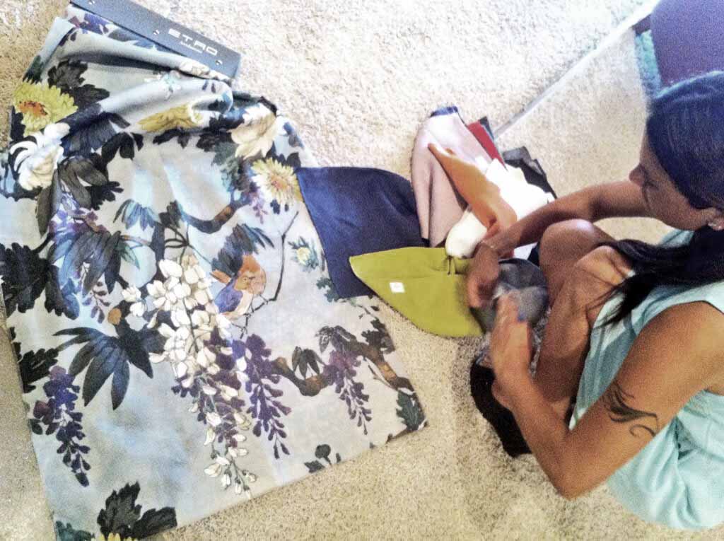
Our sofa, Time Break, is fully clad in stonewashed blue linen and then we added a decorative floral Etro fabric in shades of blue and green.
In addition, the Ribot sofa, is fully covered in a light gray natural full grain leather destined for the TV room, we decided to take the same floral color scheme as Time Break but this time we used solid colors. Great attention was given to color combinations so making the choice of materials became clear, we chose elegant and sophisticated fabrics for the living room.
The two sofa beds, Robinson and Passepartout were also treated with the same care, we targeted functionality as being an important element not to mention color. We chose a dark blue denim for Robinson and the color, duck egg, which is similar to blueberry in a soft cotton for Passepartout.
For the bedroom, we chose Soho, the headboard is padded with soft goose down and covered in charcoal gray cotton, a choice that enhances the design of the bed.
Having seen all the models together, I am beginning to get curious to see them in their new environment!

